SensiAir: from the LoRaWAN sensor to the regulatory PDF
I built SensiAir because most “air quality” tools I came across stopped at a green gauge and a CO₂ graph. I wanted to go all the way down the chain: from the physical sensor placed in a classroom to the PDF report a principal can present to an inspector. A multi-tenant SaaS platform, with a kiosk mode for the lobby and an admin console that monitors its own health. Here’s how it’s put together under the hood, and why I made these choices.
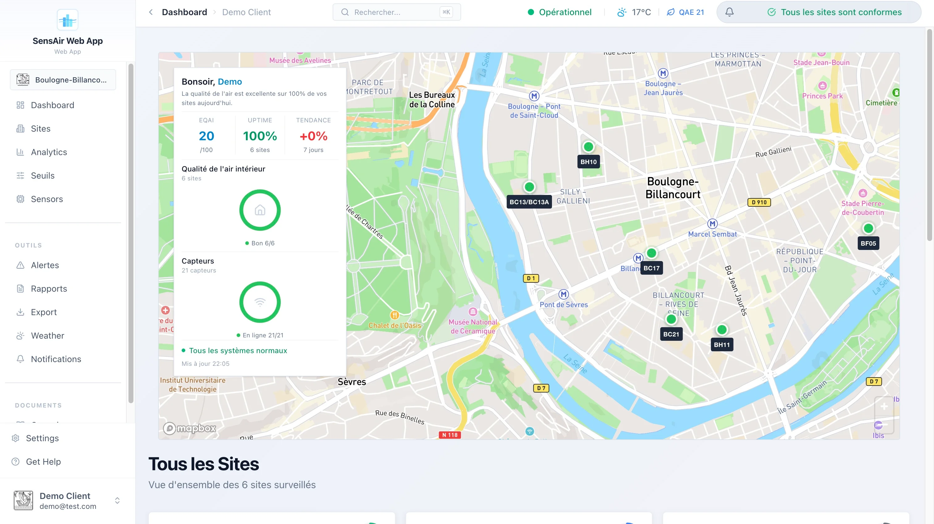
The dashboard on open: all of a client’s sites geolocated, their air index at a glance, and the fleet status (here 100% of sensors online).
the problem: indoor air, and the paperwork that comes with it
We spend about 90% of our time indoors, and the air we breathe there is often more loaded than the street’s: CO₂ climbing in a poorly ventilated room, fine particles, volatile organic compounds. In France, this is no longer just a comfort matter. Establishments open to the public (schools, daycares, middle schools) have a monitoring obligation, with an annual assessment of ventilation means overseen by the Cerema.
Measuring is one thing. Proving it to an inspector is another. That’s the point I wanted to handle end to end: not stopping at the data, but producing the document that makes it enforceable.
the product tour in five minutes
On the user side, the authenticated app revolves around a few dense pages:
- Map dashboard. All of a client’s sites on a map, color-coded by air index, side panel on click, KPIs (average index, uptime, 7-day trend, active alerts). I lazy-loaded the Mapbox map (~1.6 MB) so it wouldn’t weigh down the first render.
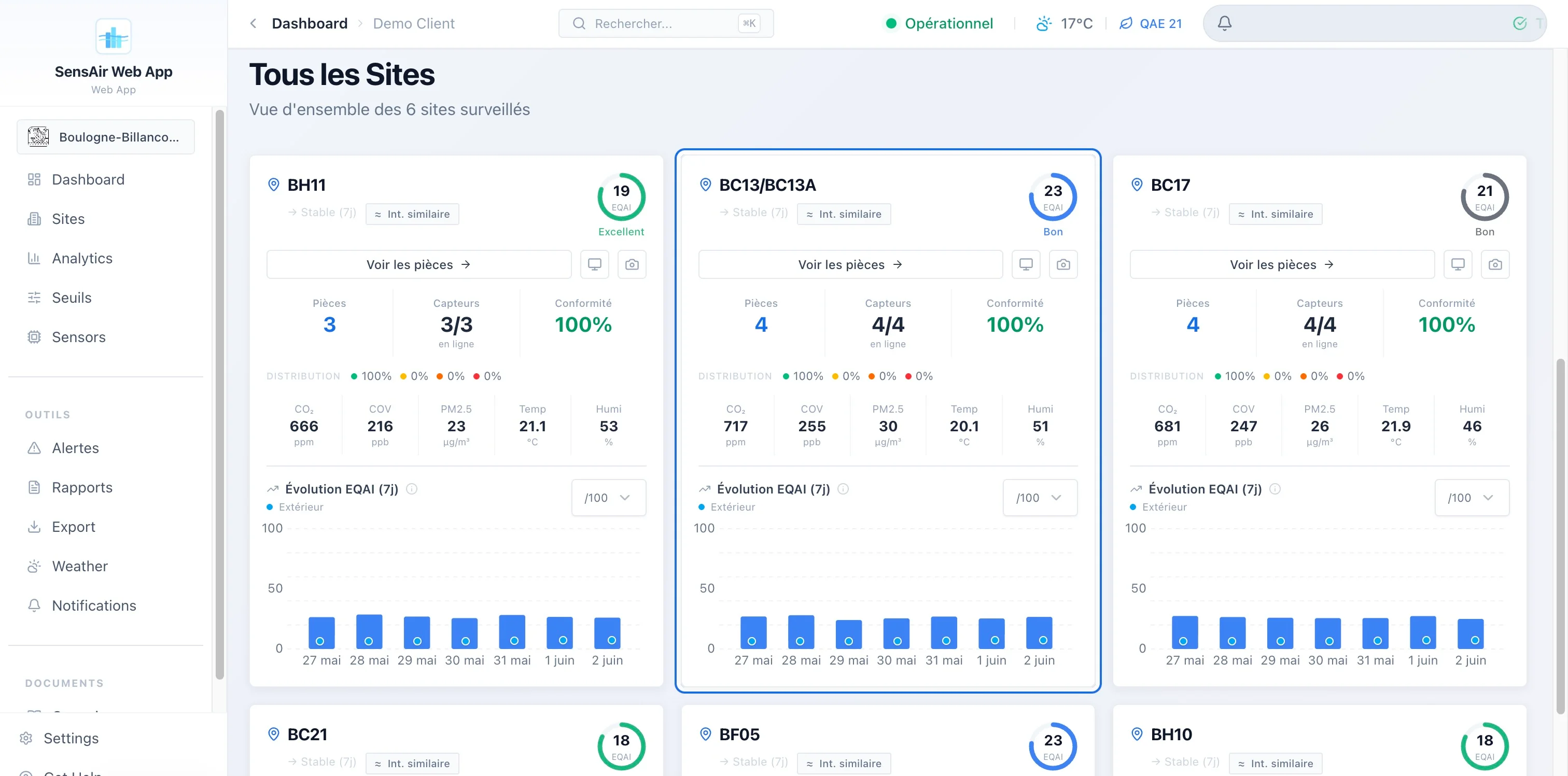
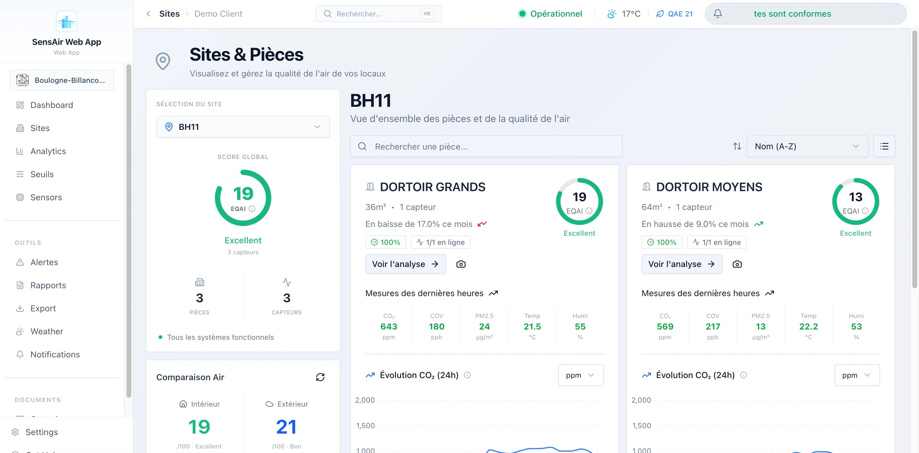
- Sites and rooms. Detailed inventory, with a comparison of indoor air against outdoor weather conditions when I know the site’s coordinates.
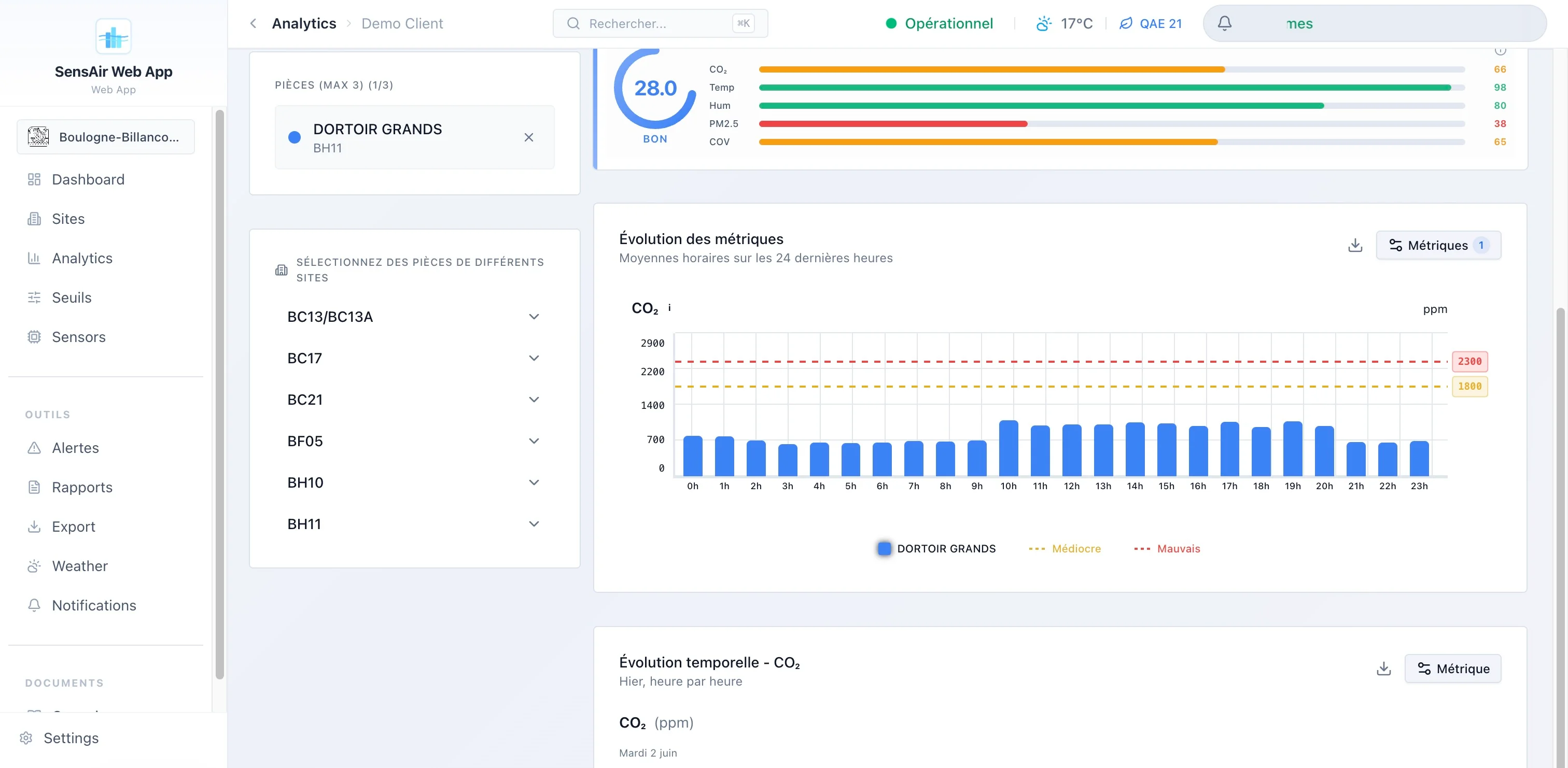
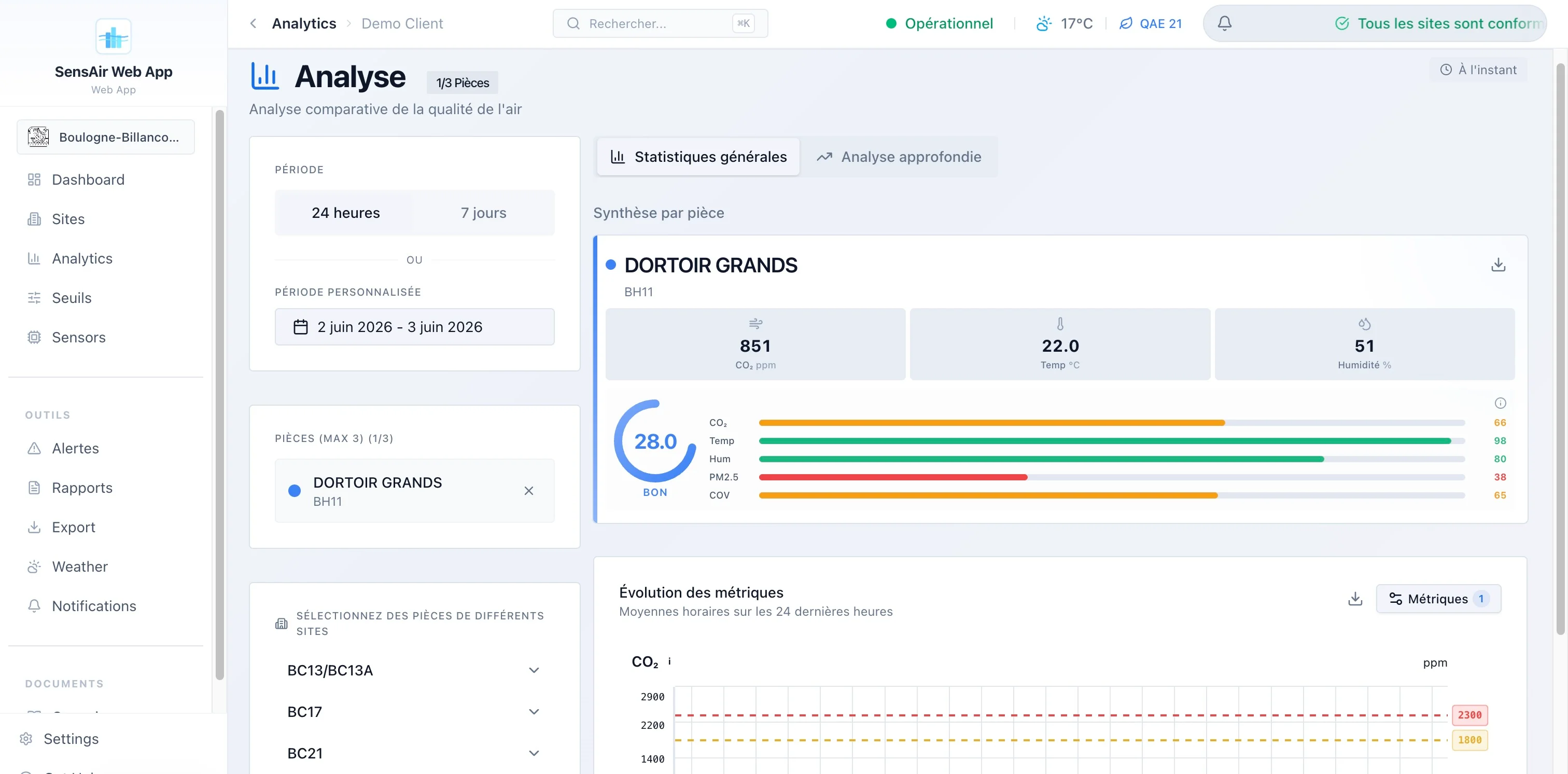
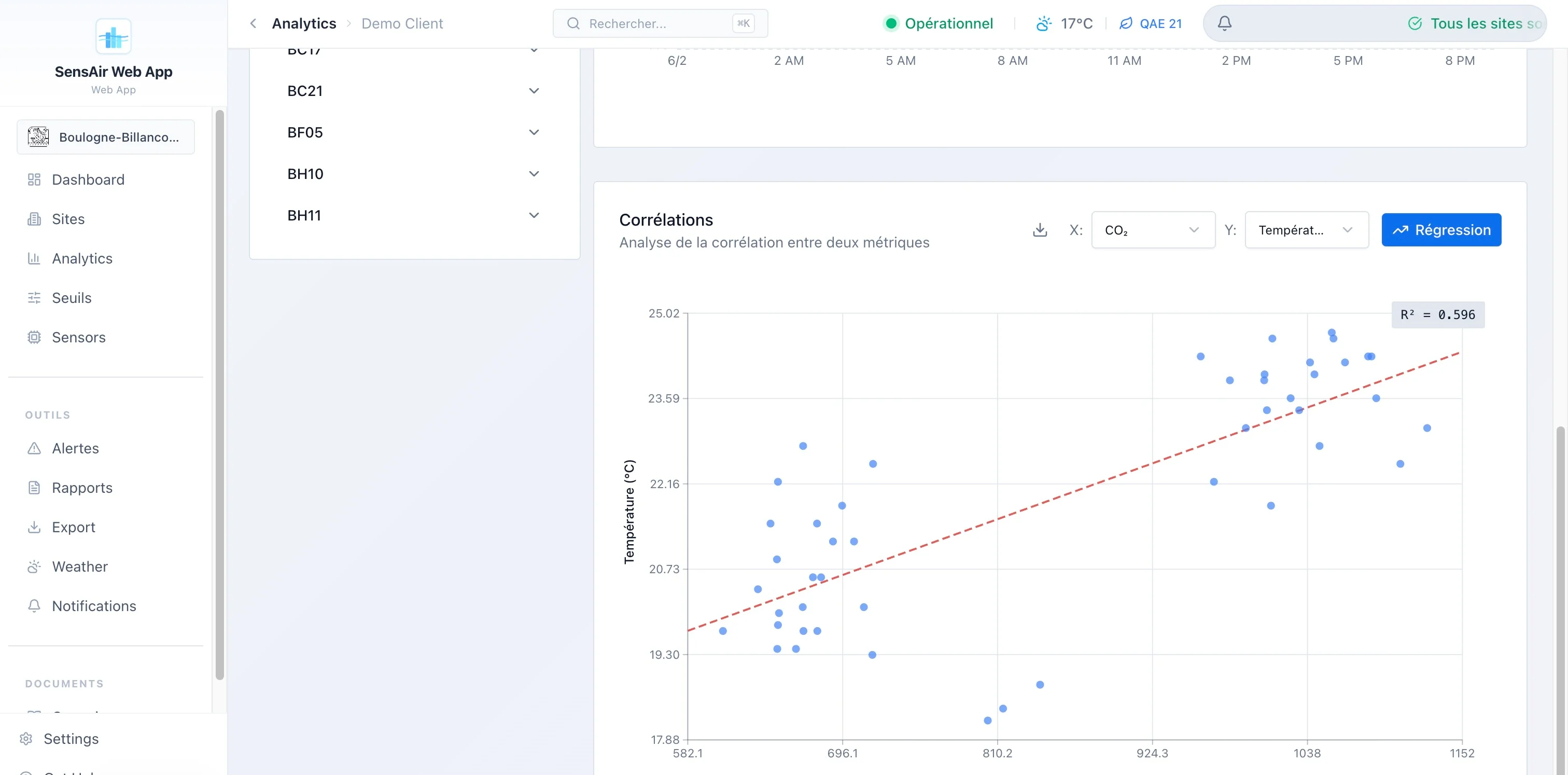
- Analytics. Comparison of three rooms in parallel, hourly heatmaps, distributions, score radar, min/max/mean/standard-deviation stats. The deep-analysis tab is lazy-loaded too.
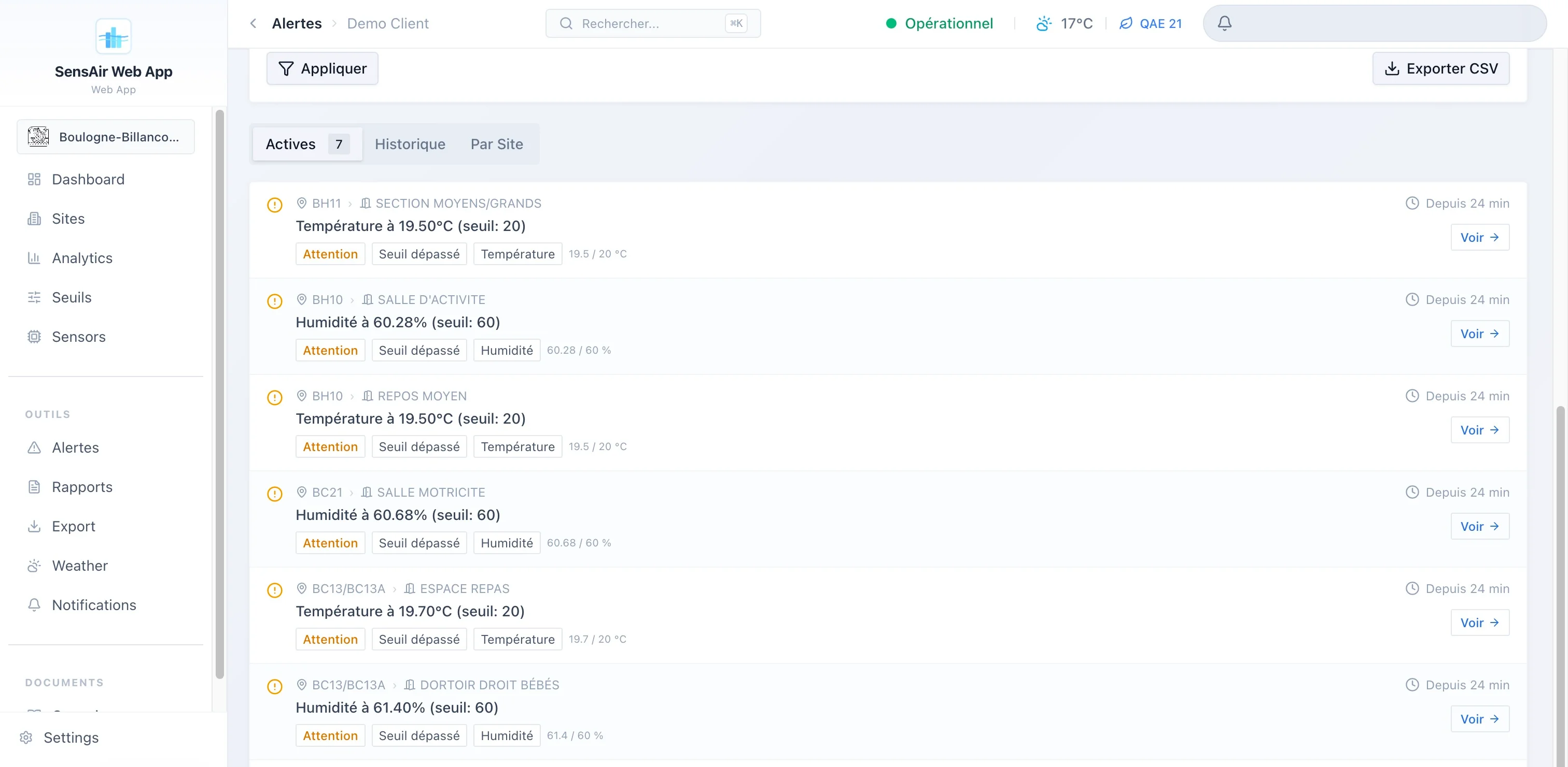
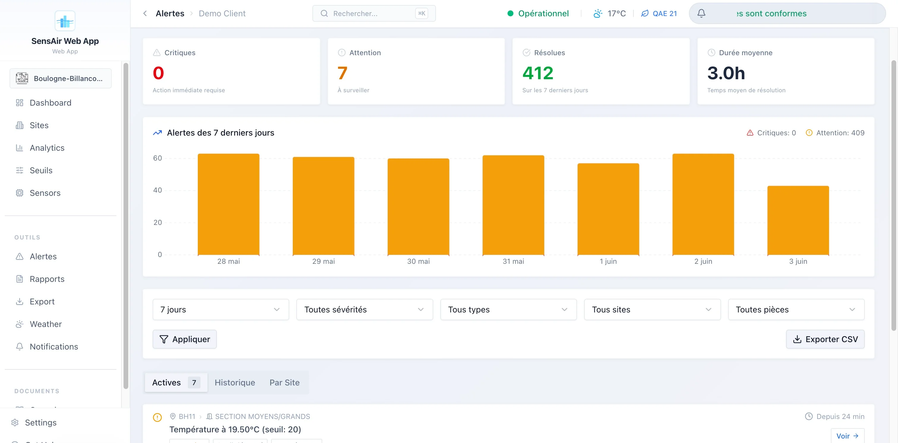
- Alerts. Four distinct types (threshold exceedance, sensor offline, sensor in error, empty location), two severity levels, history with duration and resolution notes, fine filtering and CSV export.
- Public kiosk. A login-free route, built for a lobby screen: animated index gauge, building illustration colored room by room, refresh every 30 seconds.
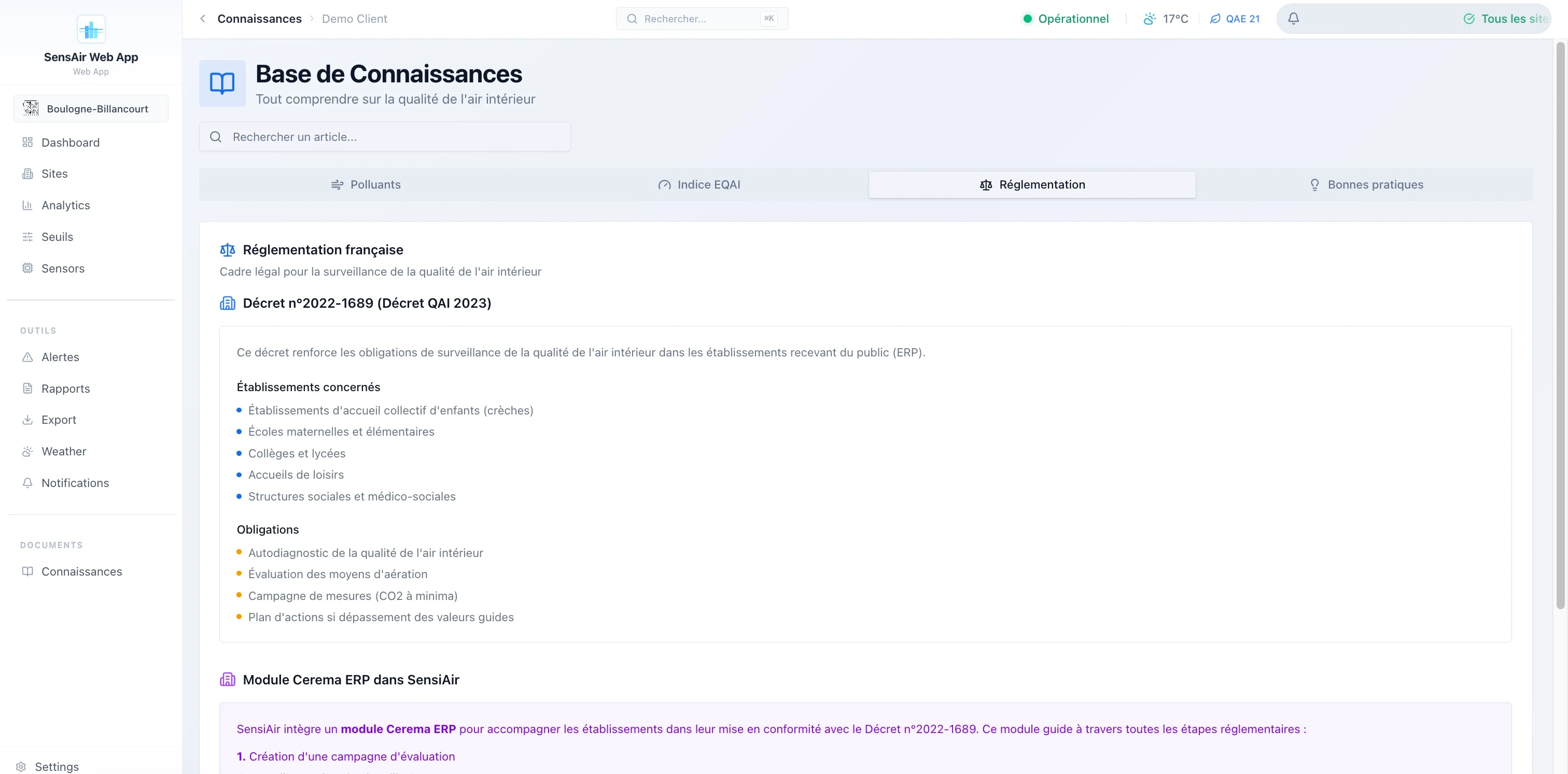
- Cerema / public buildings. A full module of its own: campaigns by establishment type, regulatory questionnaire, self-diagnosis backed by sensor data, action plan, signed validation and a public sharing link for the report.
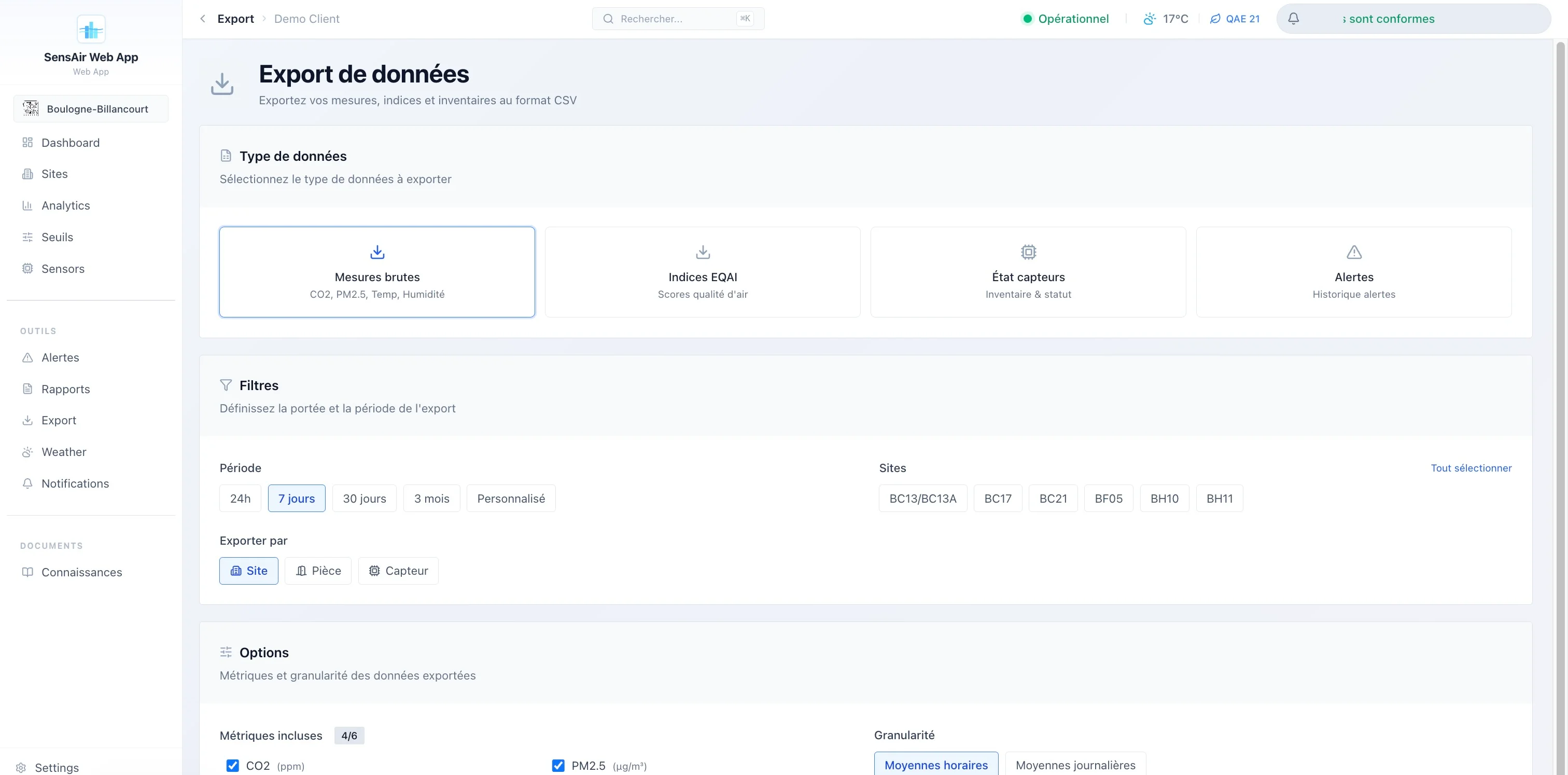
- Reports. PDF generation (standard or detailed), with optional AI-written analysis, and a CSV export by room, site or sensor.
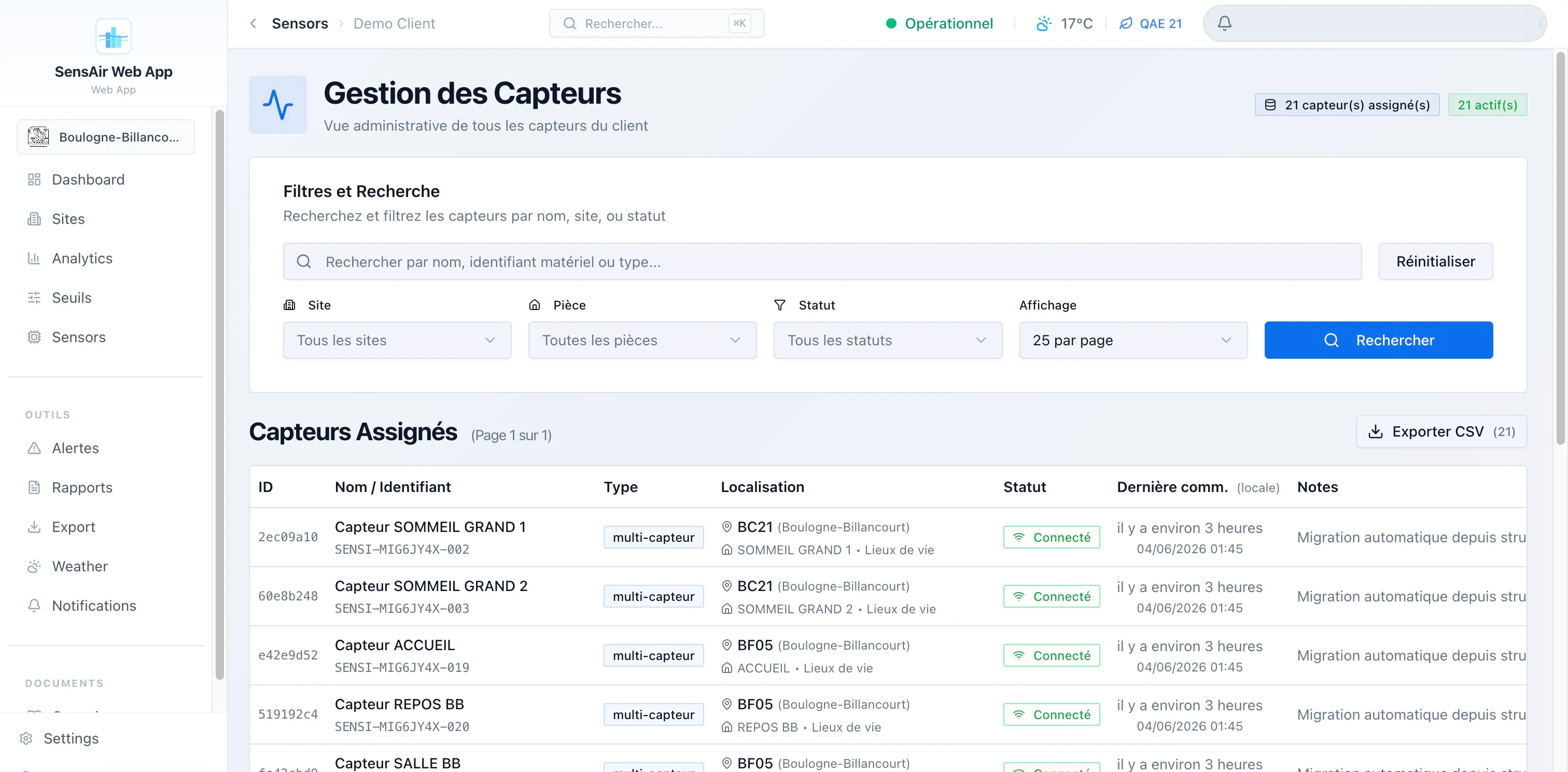
And behind it, a super-admin console that’s no gadget: monitoring of ingestion requests, database and CRON-job health, audit log, tracking of external-API consumption and per-client quotas.
Kiosk mode: a login-free welcome screen, index gauge and building colored room by room, refreshed every 30 seconds. Built for a school or office lobby.
the stack: recent, and owned
I didn’t do things by halves on the tooling. The project runs on SvelteKit 2.47 with Svelte 5.41, runes included ($state, $derived, $props, $effect), served SSR via the Node adapter, built with Vite 7. The UI relies on Tailwind CSS 4 and a homemade component library based on bits-ui (shadcn-svelte style), with lucide for icons.
The data lives in Supabase (PostgreSQL + Auth + Row Level Security), accessed via @supabase/supabase-js and @supabase/ssr. I regenerate the TypeScript types from the database’s real schema, which spares me drift between the SQL and the frontend. Charts are rendered client-side with LayerChart (a D3 wrapper for Svelte) and server-side directly with D3 for the PDFs. i18n goes through Paraglide: compiled at build time, zero runtime overhead, FR and EN. Sentry watches errors, Zod validates inputs.
flowchart LR
  Capteurs["Sensors<br/>CO₂ · PM · temp · humidity"] -->|"JSON / LoRaWAN"| Ingest["Edge Function<br/>ingest"]
  Ingest --> DB[("PostgreSQL<br/>Supabase")]
  DB --> RLS{"RLS<br/>multi-tenant"}
  RLS --> SSR["SvelteKit SSR<br/>adapter-node"]
  SSR --> Web["Authenticated app"]
  SSR --> Kiosk["Public kiosk"]
  SSR --> PDF["PDF reports<br/>Puppeteer + D3"]
The processing order of requests matters to me. My hooks.server.ts chains five stages: Sentry, Supabase session init, authentication check and role-based redirect, security headers (HSTS, CSP, X-Frame-Options), then cache headers differentiated by route (the kiosk can be cached longer than the dashboard). Classic middleware, but explicit and ordered.
To give a sense of the mass: roughly 130,000 lines in src/, 264 Svelte components, 62 routes, 42 SQL migrations, 20 tables and 5 views. This isn’t a weekend prototype.
the data model: isolated by design
Everything is arranged in a strict hierarchy, and all isolation between clients rests on PostgreSQL’s Row Level Security. A user sees only the data of their client_id, without my writing a single WHERE clause by hand in the queries: the database filters. Super-admins switch from one client to another via a URL parameter, and use a service_role client for admin views that must cross the tenant boundary.
flowchart TD
  C["clients"] --> S["sites"]
  S --> P["rooms"]
  P --> CV["virtual sensors<br/>(logical slot)"]
  CV -. "historized assignment" .-> CAP["sensors<br/>(physical hardware)"]
  CAP --> M["raw measurements"]
The decision I’m proudest of hides in this diagram: the split between virtual sensor and physical sensor. The virtual sensor is a logical slot, stable over time, attached to a room. The physical sensor is hardware that fails, gets replaced, gets recalibrated. By historizing the assignments between the two, I can swap a faulty unit without breaking the continuity of the measurement series or losing the room’s history. That’s exactly the kind of choice that comes from my original trade: in the field, hardware moves, and the data model has to absorb it.
ingestion and the pipeline: from raw to pre-computed
The sensors send their measurements to a Supabase Edge Function (/functions/v1/ingest), which accepts two formats: my native SensiAir format and The Things Stack’s for LoRaWAN. Authentication is by API key (prefix sak_), with rate limiting and fine-grained logging of each request (api_ingest_logs: device, status code, error category, latency). It’s this table that feeds the entire ingestion-monitoring page on the admin side.
Rather than running GROUP BY over millions of raw rows on every display, I pre-aggregate in successive stages, with PostgreSQL CRON jobs:
flowchart LR
  M["raw measurements<br/>~48 h"] --> H["hourly averages<br/>~30 d"]
  H --> J["daily averages<br/>~1 year"]
  M --> A["current averages<br/>+ pre-computed EQAI"]
  A --> ALERT["capture_toutes_alertes()<br/>hourly at :05"]
Practical consequence: the index, its label and its color are already computed and stored by the time the user opens a page. The read is O(1). Retention decreases with granularity (raw a few days, hourly a month, daily a year), which keeps the database light without losing the long trend.
the EQAI: a composite index, and inverted
At the center, the EQAI (European Quality Air Index), rated 0 to 100, with a convention that surprises at first: lower is better. 0 is excellent, 100 is bad, the opposite of EPA-type indices. I adjusted all the display logic accordingly, across five color tiers (green, blue, yellow, orange, red).
It’s composite, computed by a PostgreSQL function from four weighted metrics:
pie showData
  title EQAI weighting
  "CO₂" : 40
  "PM2.5" : 20
  "Temperature" : 20
  "Humidity" : 20
I gave CO₂ the heaviest weight because my main target is the ventilation of occupied rooms. Alerts rely on thresholds stored as JSONB per client (seuils_clients), with pre-configured reusable reference sets. When thresholds are modified, I call the capture function immediately for an instant recompute, rather than waiting for the hourly pass.
the reports: where it gets serious
Generating a proper PDF server-side, in a serverless environment, isn’t trivial, and it’s the part that cost me the most. I assembled a complete chain: D3 produces SVGs (curves, heatmaps, gauges, compliance radars), a headless DOM renders them, Puppeteer with a slimmed-down Chromium (@sparticuz/chromium) captures, and pdf-lib assembles the final document. Automatic environment detection (Vercel, Lambda) to switch to serverless mode.
The content ranges from the executive summary to the fleet inventory, by way of per-site results and the indoor/outdoor comparison. Optionally, an AI provider (configurable, with a mock fallback if no key is supplied) writes analyses and recommendations. And for public buildings, the Cerema report follows the regulatory framework (Decree No. 2022-1689, known as the 2023 IAQ Decree), with signed validation and a public sharing link.
The deliverable: a server-side generated PDF report (D3 charts, written analysis), ready to archive or present at an inspection. This is what turns measurement into proof.
It’s this part that turns a pretty dashboard into a tool someone pays to use: it doesn’t just show that the air is good, it manufactures the proof to archive.
what I take away
What matters to me in SensiAir isn’t an isolated technology, it’s the coherence of having owned the whole chain. The virtual/physical sensor decoupling anticipates the real life of the hardware, because I come from electronics and I know that a sensor gives out. Pre-computing the aggregates treats performance as a schema decision, not a late patch. And the Cerema module anchors the whole thing in a concrete, paying need rather than in a demo.
What’s next is already in the code: push and SMS notifications, 2FA, automated email reports. The story isn’t over.